Updated July 26, 2026
Ask anyone why they miss old Google Finance and you get the same answers. It was fast. It was dense. You could see a whole position in one screen. It never tried to talk to you.
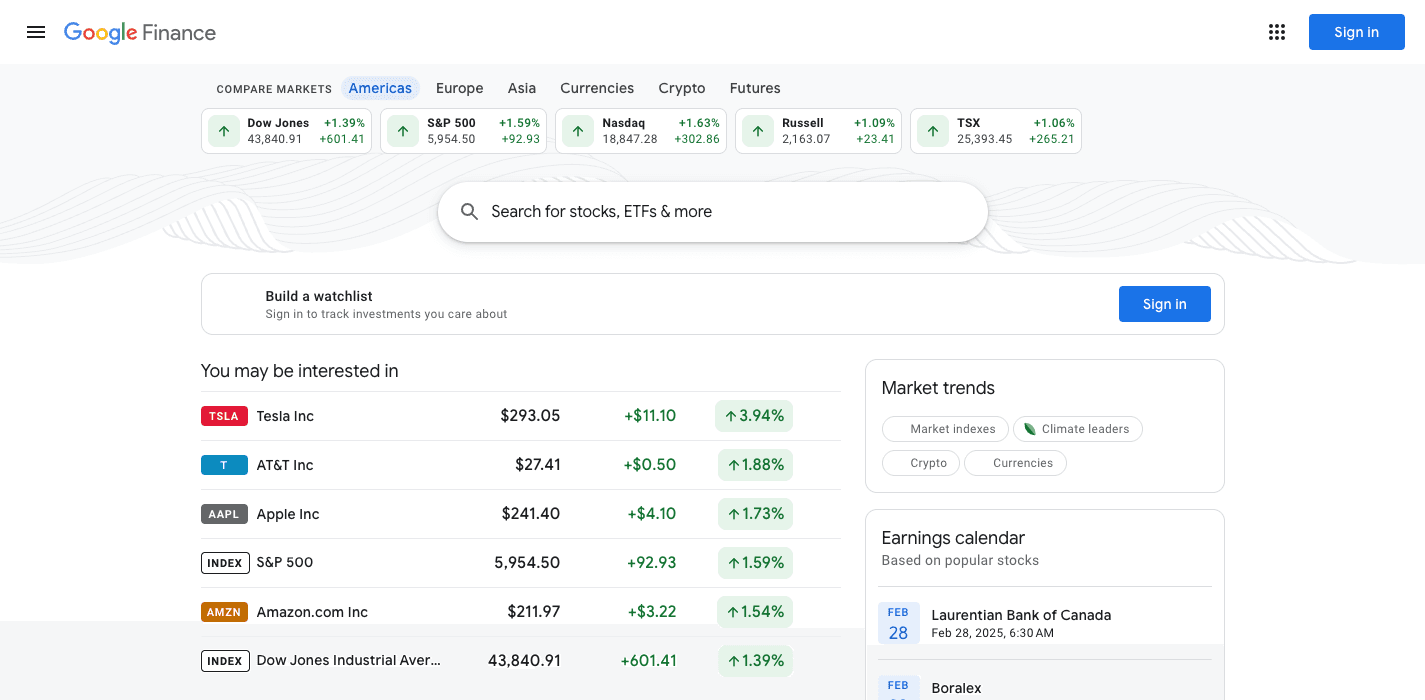
The new version has AI summaries, a chat box, and a fraction of the information density. Reviews on forums and Reddit call it useless, a disappointment, and worse. The petitions asking Google to restore the old site collected signatures within days.
What people say they miss most
We read the forums, the petitions, and the reviews so we could rebuild the right things. The same features come up every time.
- Portfolio tracking with transaction history and cost basis
- Watchlists that read like a table, not a feed
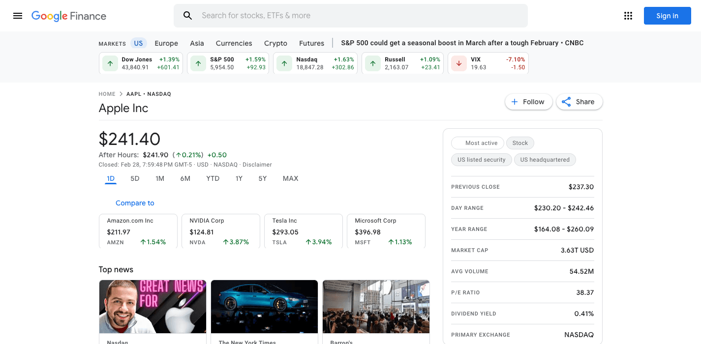
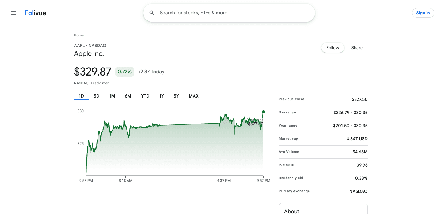
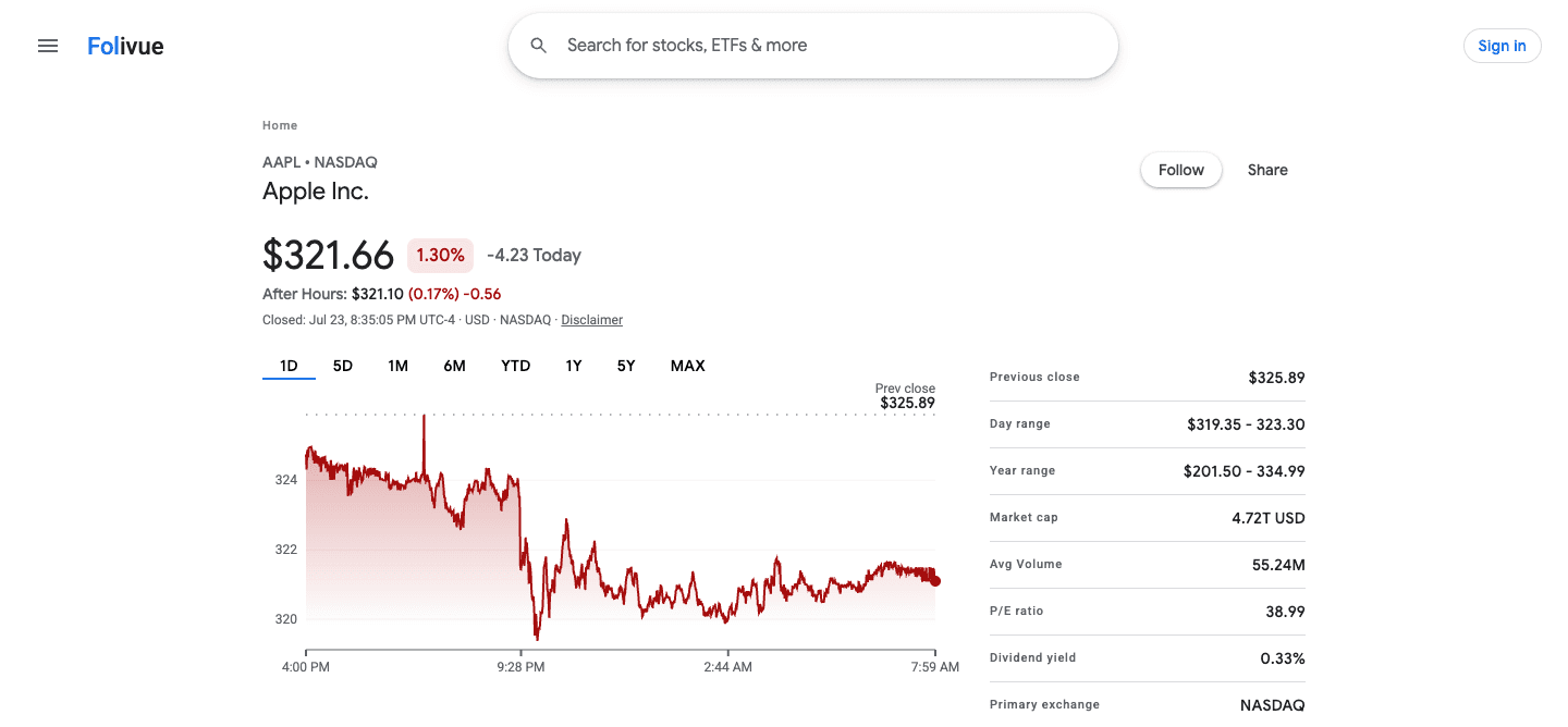
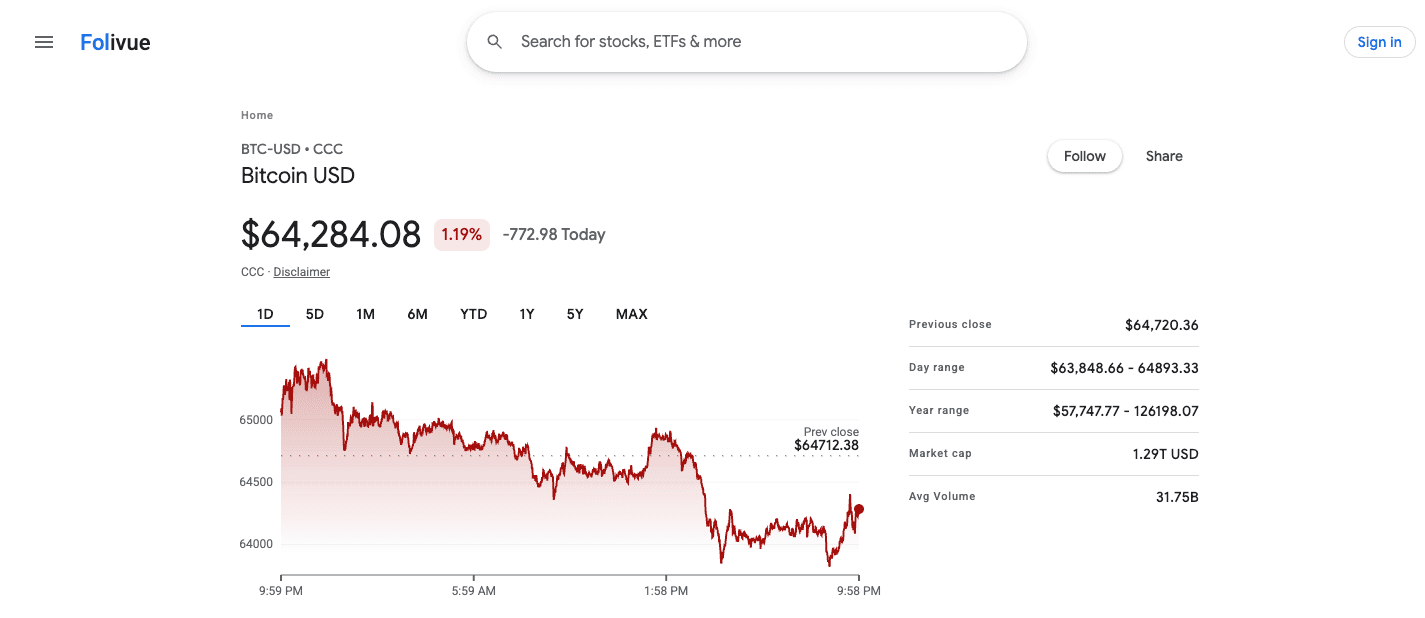
- The two-column stats grid: open, high, low, mkt cap, P/E, div yield
- Charts with volume, long history, and instant range switching
- Related news attached to each ticker without AI rewriting
Why the old design was actually good design
Old Google Finance respected a simple rule: the user came to see numbers, so show the numbers. Information density was a feature. Speed was a feature. Predictability was a feature. Modern product design calls this dated. Investors call it usable.
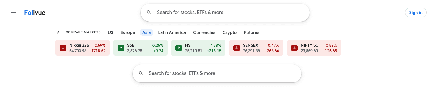
Folivue is old Google Finance, alive again
We rebuilt the interface people describe when they say old Google Finance: the layout, the chart style, the density. It launches next week. The waitlist gets in first.
Frequently asked questions
What happened to old Google Finance?
Google replaced it with an AI-powered redesign. The old design was retired for everyone in July 2026 when the toggle back to it was removed.
Is there a petition to bring back old Google Finance?
Yes, more than one. Petitions on Change.org ask Google to restore the classic version, citing lost portfolio tools and navigation. Google has not restored it.
How close is Folivue to the old design?
Very close. Rebuilding the old layout faithfully is the entire point of the project, down to spacing, type, and the classic green and red.