Updated July 26, 2026
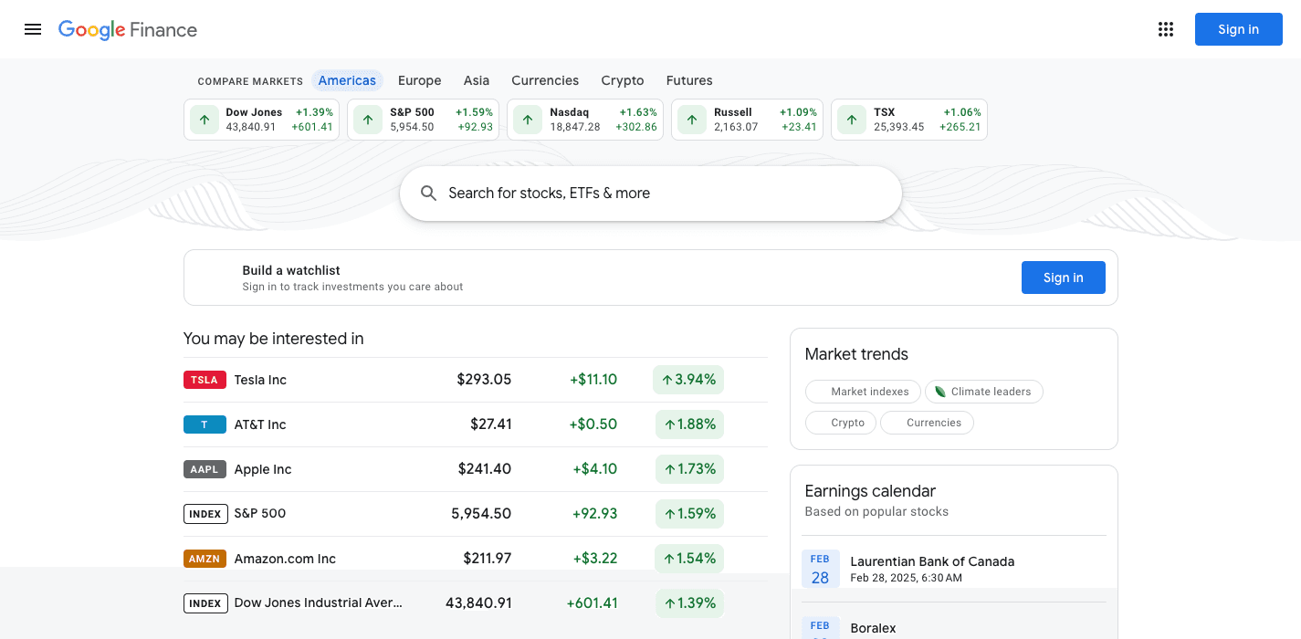
The Google Finance old design was not an accident. Every part of that page earned its place over years of iteration, and the redesign threw the structure away in one release.
This page breaks down what the old design got right, and how Folivue recreates it.
The anatomy of the old quote page
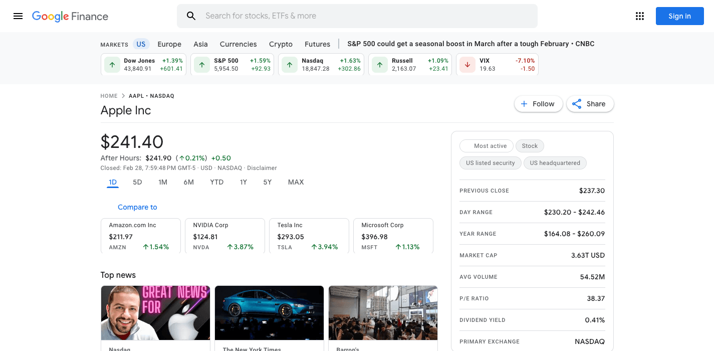
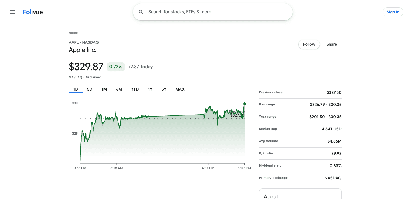
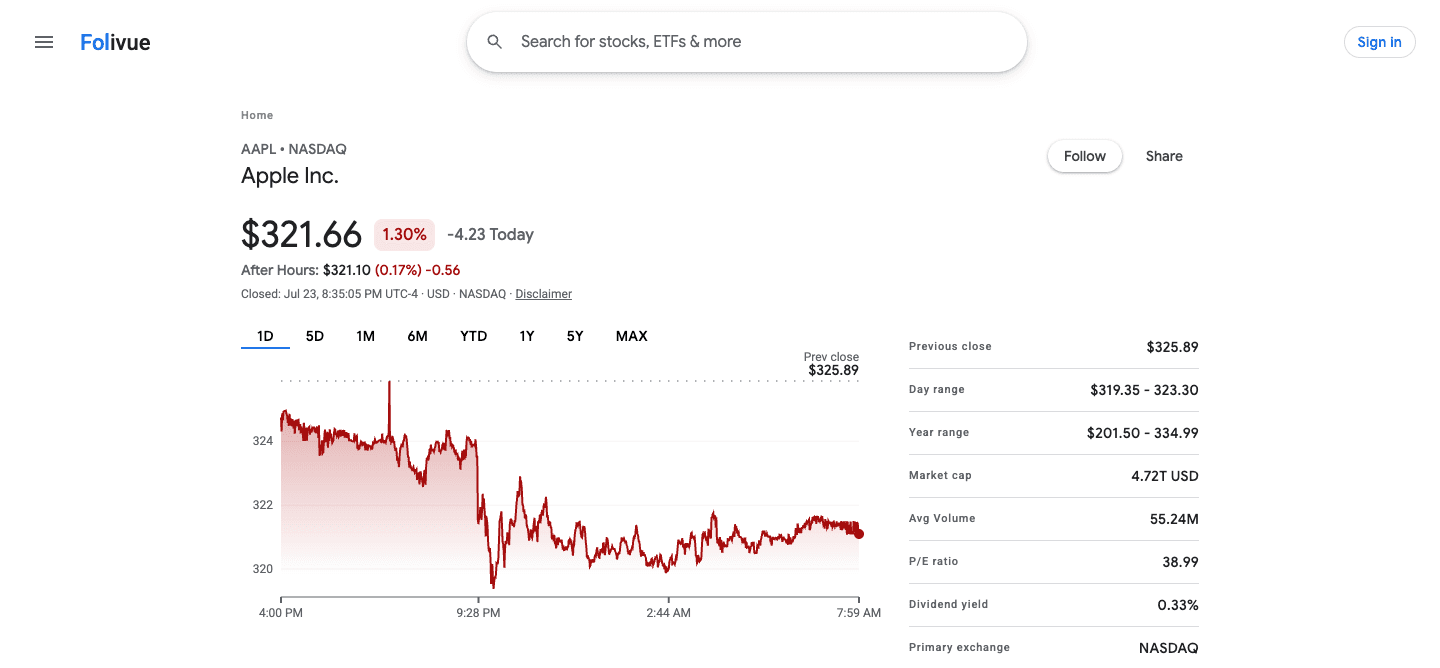
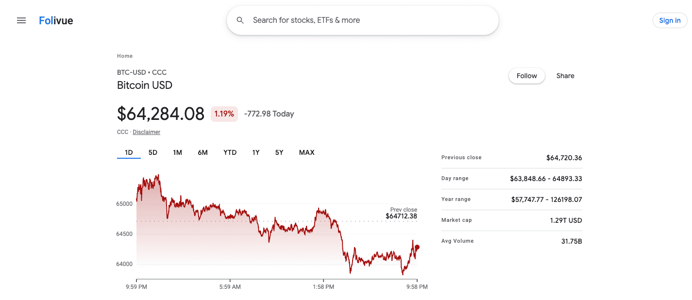
The old design followed a strict hierarchy. Price and daily change at the top, large and unmissable. The chart directly below, defaulting to one day. Then the stats grid, two columns of the numbers investors actually check. News at the bottom, in a plain list.
Nothing competed for attention. The page answered the question you came with, in the order you would ask it.
Density is a feature
The old design fit roughly three times more data on screen than the new one. Small type, tight rows, thin rules between values. You scanned it like a newspaper listing. The redesign replaced that with cards, whitespace, and an AI summary that pushes the numbers below the fold.
What faithful recreation means in Folivue
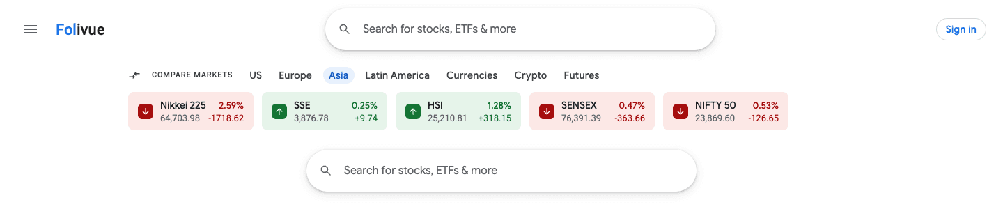
Folivue rebuilds the old structure: same hierarchy, same density, same chart behavior, same classic green for gains and red for losses. Modern under the hood, familiar on the surface.
Frequently asked questions
Why did Google change the Google Finance design?
Google rebuilt Finance around AI features like generated answers and summaries, matching its broader product strategy. The old design was retired in July 2026.
Does Folivue copy Google's code or assets?
No. Folivue is built from scratch. It recreates the layout and feel of the old design without using Google code, data feeds, or branding.
Will Folivue work on mobile?
Yes. The classic density adapts to smaller screens while keeping the same hierarchy: price, chart, stats.